RESTAURANT LOGO
A favorite design for a small limited menu restaurant in a big box DIY store chain –project evaporated, not produced.
Agency: DDB Chicago
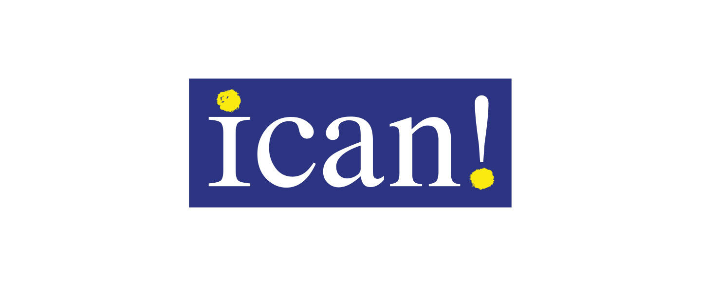
REPRODUCTIVE SELF-DETERMINATION PROGRAM
The ICAN! mission is to advance reproductive health equity in Illinois by improving the quality, accessibility and coverage of contraceptive care for all communities. The name has a unique and special duality in function – it works as an acronym, and it’s an effortless and bold rallying cry that declares and affirms self-determination. The logo had to be simple, like the access it was providing. Designed in trustworthy blue we represented individuality with hand drawn "sun" accents, suggesting reproductive life from sun-up to sunset. The inclusion of the exclamation point added energy and positivity.
Agency: Burrell Communications
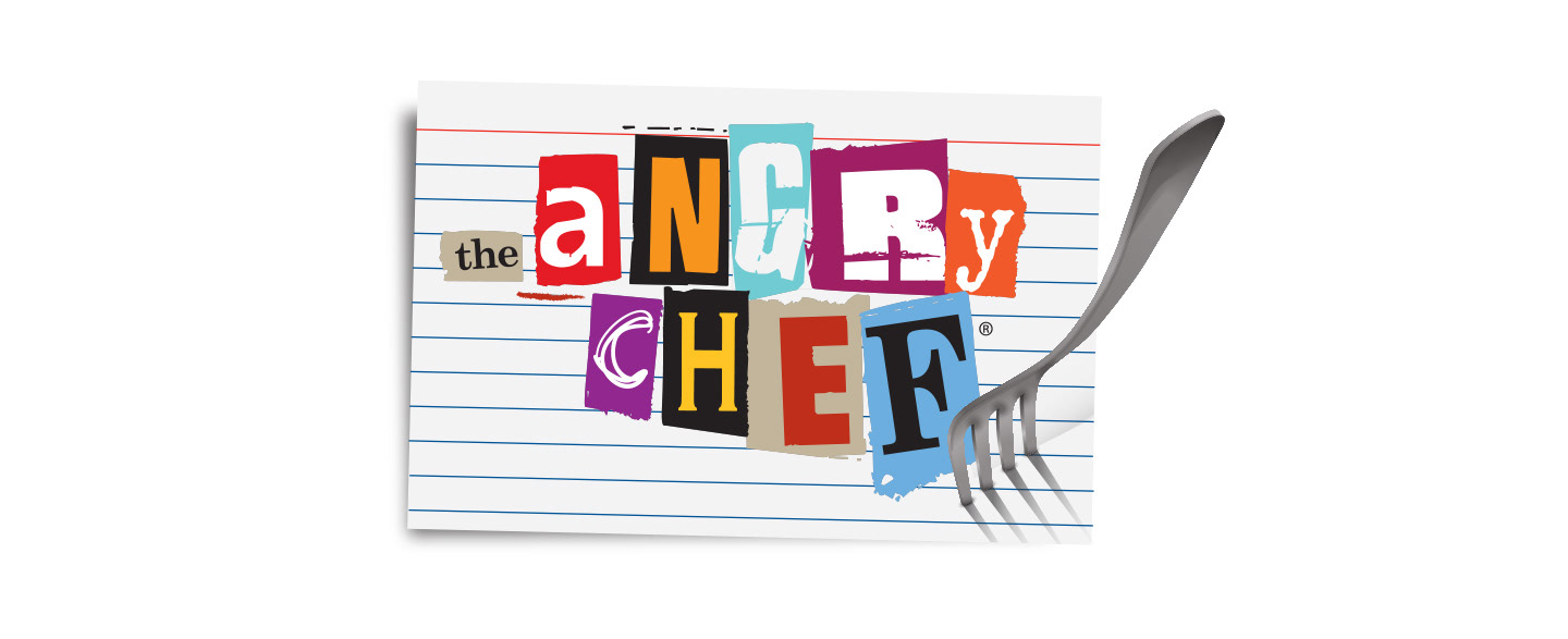
THE ANGRY CHEF
For Julie Isaacson’s hilarious collection of satisfying recipes, inspired by unsatisfying relationships, we created an angry treatment of a ransom note recipe card pinned by a fork.
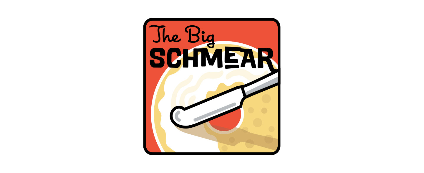
PODCAST LOGO
A clever name for a delicious podcast about Jewish food deserved a fun treatment to match the lively content. Notice the "EAR".
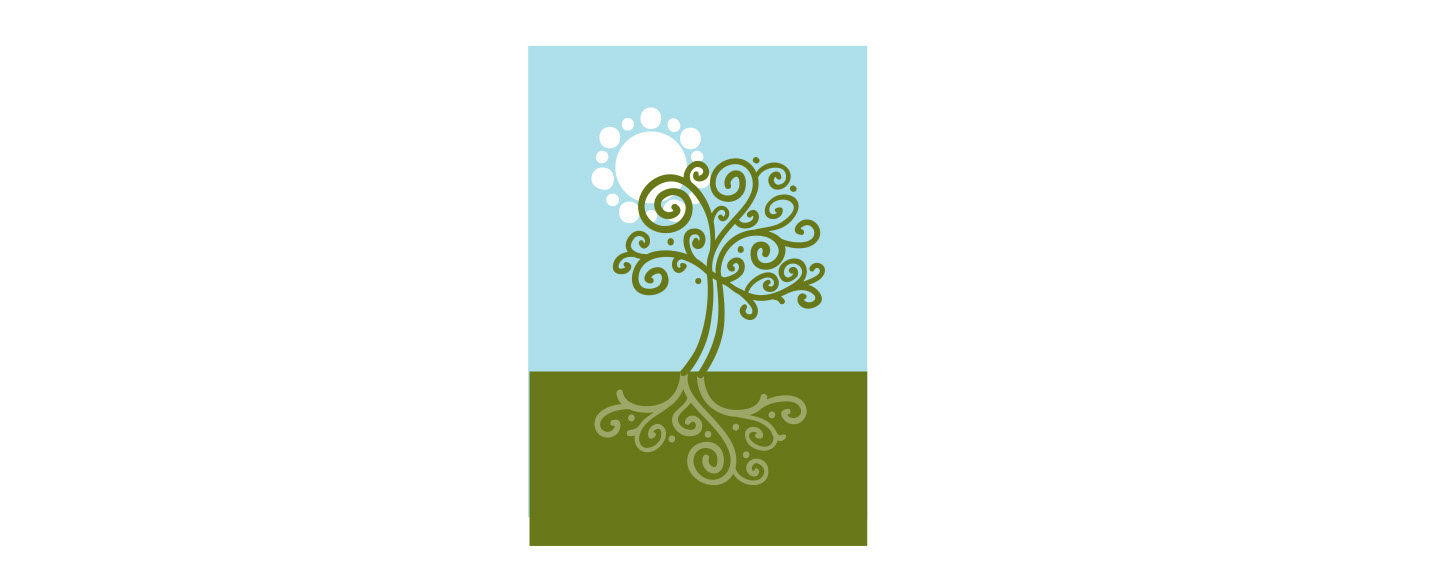
PSYCHOLOGIST LOGO
A psychologist, wanted her mark to feel life-affirming and to show growth, representing the way patients progress through their therapy. A tree of life that grows tall above ground while growing strong roots below was the perfect metaphor. Natural calming colors and round shapes made the image comforting and approachable.
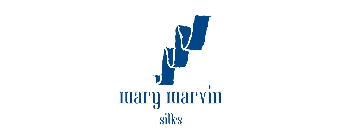
SILK SCARF ARTIST
Mary Marvin is a fiber artist who makes hand painted silk scarves. The double M of her name and the fluid quality of the scarves are echoed in the mark.
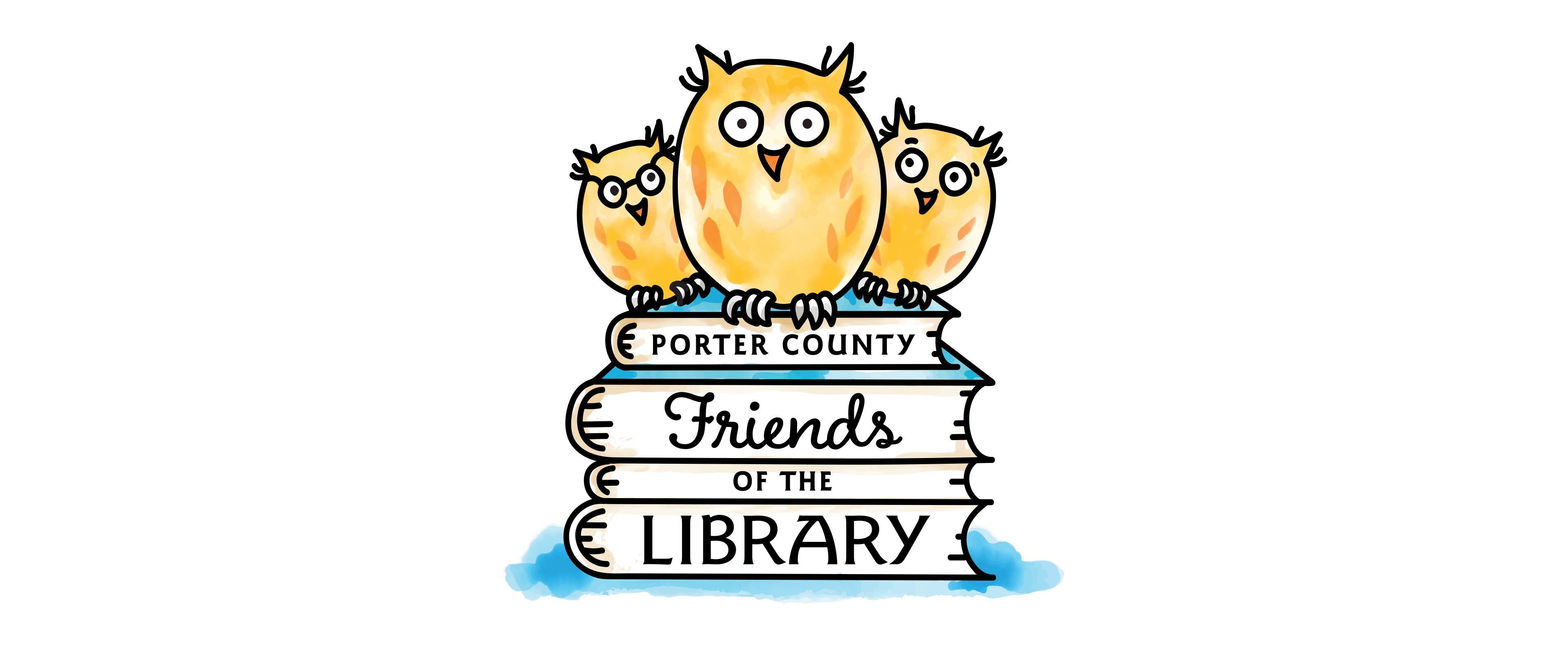
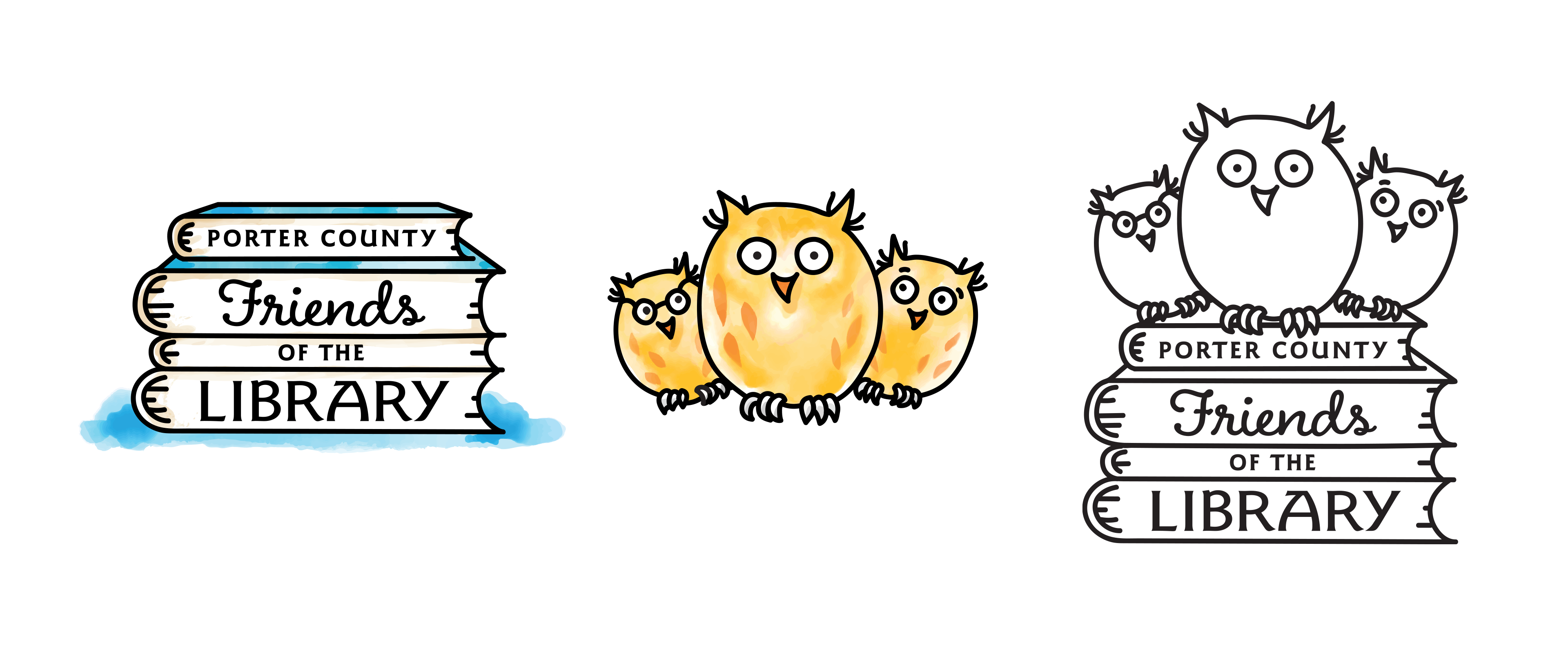
LIBRARY FRIENDS LOGO
The Friends of the Library in my county had a contest for a new logo and I won! Woot! Since they raise money for library programs, maybe they sell branded merchandise. I thought, what would I want to buy, or what would kids like on a book bag or travel mug? How about some cute characters?!
Owls often represent wisdom, knowledge, change, and transformation, all of which the Friends are bringing to the libraries, funding modern programs and equitable access to information and culture. We created 3 characters with different personalities and combined them with some stacked books to cue library. We also made separate versions of the books and of the characters and as a black and white line-drawing for maximum flexibility to jazz up their communications.
I can't wait till those book bags are available...
OTHER ORIGINAL LOGOS
A variety of styles that reflect the brand personality of the clients.
LOGO UPDATES
Sometimes a logo just needs a refresh – something that updates it without throwing away its valuable brand identity. Redesign goals can be anything from more closely conforming to the the parent company identity or to making the type more contemporary. Knowing how far to change the logo requires close collaboration between the designer and client so what is precious remains. Here are just a few brands I had the privilege to update.
Agency: Burrell Communications