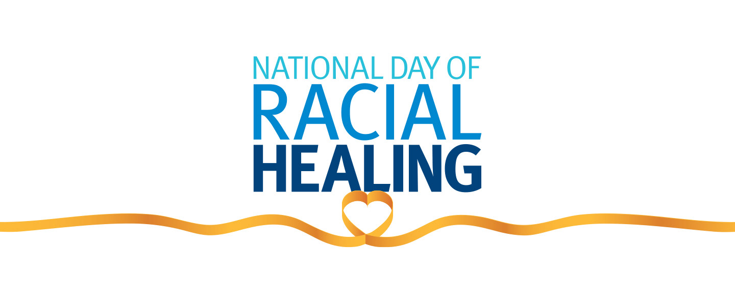
NATIONAL EVENT LOGO AND VIS ID
Branding for a national foundation's racial healing program included logo, social posts, posters, an engagement guide, signage, and digital, print and video ads. The colors, size and weight of the type showed growth and strength from the process. The ribbon implied heart and love at the core of the process, wrapping around all to mine the gold in our shared humanity.
To maintain the brand look and feel for all the events being promoted by the event partners across the country, we created a very detailed brand guide PDF with hot-links to digital assets.
Agency: Burrell Communications
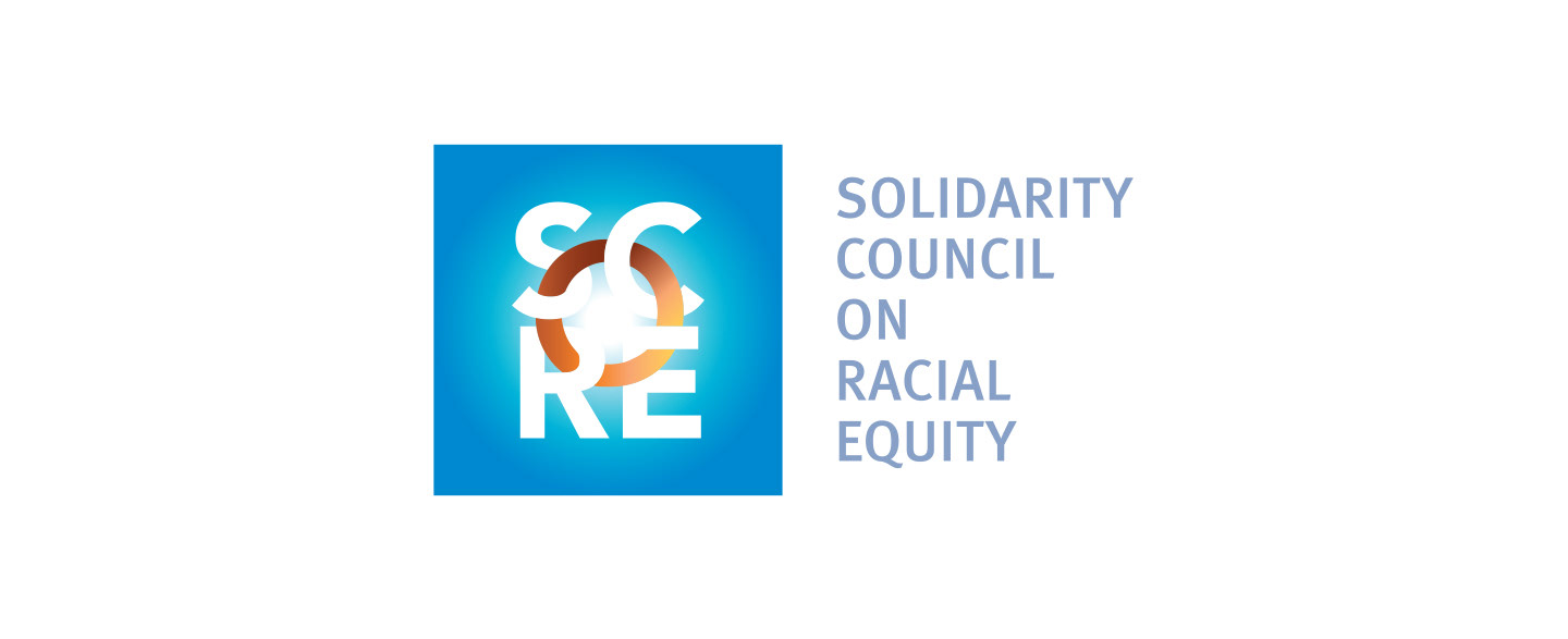
COUNCIL LOGO
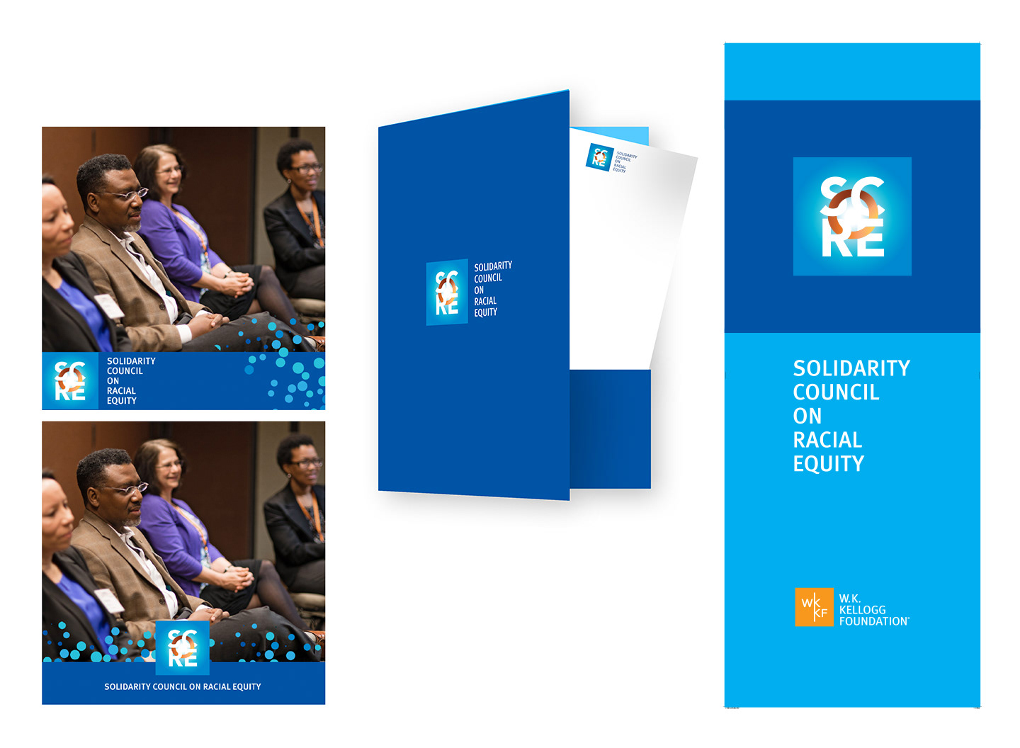
To expand the reach of their work on racial equity, this national foundation established a council of luminaries and thought leaders from advocacy, the arts, entertainment, business, education and media. The mission of their unified action is to place racial equity center stage in public awareness.
The logo and branding was designed to reflect the goals of the council in these ways:
• A embracing circle, the “O” in SCoRE, unites the other elements
• The coloration of the circle symbolizes the diverse colors of humanity in contiguous unity
• A circle of light heals and strengthens and represents inclusivity.
• The emanating glow symbolizes the enlightenment and illumination that comes with collective understanding
• The field of blue represents a blue sky of possibilities
• The logo is emotionally hopeful / optimistic
• The square shape is purposefully synergistic with the foundation logo to leverage brand identity; complementary but stands unique when used together. Colors are pulled from the parent company identity's palette and brand typography
We created social post frames, folders and notepads, retractable banner signage and a series of videos that introduced the council through social media.
Agency: Burrell Communications
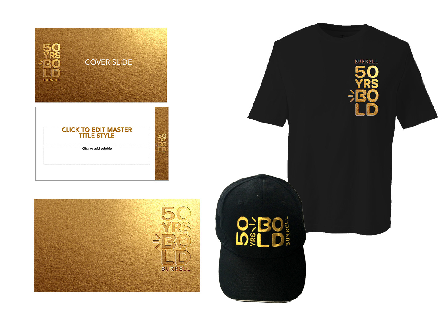
50 YEARS ANNIVERSARY LOGO
To celebrate 50 years in their groundbreaking business, Burrell asked for a logo treatment for the theme "50 Years BOLD" to use as a background for video conferences, in powerpoint presentations, and swag. We incorporated the Burrell "Screaming B" mark in the logo along with the Burrell signature in a shining golden anniversary style.
Agency: Burrell Communications